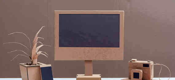
In the world of design research, I often come across the belief that prototypes should be as polished and functional as possible. The closer a prototype is to what a user of the finished product will experience, the better! Well, no, not always. High fidelity prototypes with a slick appearance and interactive elements are great for fine-tuning and polishing designs, but we shouldn’t overlook the value of the quick and dirty prototype. Here are some of the great things about putting something rough and ready in front of people:
Quick to produce
The most obvious advantage is how quickly and cheaply you can get ideas visualised. The earlier you start testing ideas, the less expensive it is to make changes. There is nothing worse than designers building beautiful prototypes only for them to be completely torn apart in the first round of user research.
Implicit permission to critique
Which is a fancy way of saying people are more likely to suggest changes to a prototype that looks like it was made quickly. One of the most common problems with design research is that people hate being negative or criticising other people’s hard work. So the more simple a prototype is, the more likely it is people will offer honest negative feedback.
Managing expectations
Another great thing about quick and dirty prototypes is that everyone knows the final product isn’t going to look anything like the design they see. This can help to get buy-in from stakeholders when you need to make major changes after user research. If decision makers see a slick prototype they can get fixated on getting something that looks and feels like what they were shown, and then it can be hard to persuade them to make changes if you need to rework your ideas during the design and development process.
Naturally, there are plenty of disadvantages too and I’m not suggesting you should always test with quick and dirty prototypes, but it’s always worth considering the low fidelity prototype and how much it can add to an iterative design and development process.
Key Advantages
- Quick and easy to create
- Participants are more likely to provider critical feedback
- Encourages people to focus on the idea, not the specifics interface
Key Disadvantages
- Without a polished UI you’re likely to get plenty of feedback that’s not particularly useful as it is focused on elements of the interaction that will change as you create more refined designs.
- Stakeholders can be slow to get behind ideas represented via simplistic prototypes.
- Prototypes without interactive elements can mean you miss vital parts of the user’s journey.
Learn more
"The power of paper prototyping" blog explains when to use a paper prototype, how to create and test it.
Watch our latest quick tips tutorial to learn about paper prototyping
Usability.gov gives a good overview of the types of prototypes you can use.
Laura Busche gives a more in depth breakdown of low fidelity prototypes including a brief history.


